


First chapter is on the Art Portal now: https://www.newgrounds.com/art/view/fedev/predatheosis-1
So, no update this week, sadly. I've been working on Chapter 2 quite a lot these days, though. From rewriting it multiple times nearly from scratch each time, to roughly sketching about 40/50 pages, only to just change my mind and start from zero again.
Buut I finally started working on what I hope is going to be the final version. It's fully written and I'm about halfway through sketching all the pages (sketched 20 so far, I assume I have around 20 left, but I'm still not sure). I'm still making slight modifications here and there, which is why I want to start uploading once everything is sketched (and sorted) out.
This chapter is kind of the opposite to the first: it starts slowly, but halfway through action kicks in. I mainly want to establish clearly who the main character is, along with the antagonist. I may do a bunch of double uploads here and there to not make things too slow, but that will depend of how much time I have in my hands.
The first chapter was barely planned. A lot of times I came up with the pages on the spot, and the ending changed about 3 times during it's production. The writing ended up a bit sloppy, so I want to do better. Also, the tone was way more serious that I originally intended. Not saying that things are going to get super goofy, but I want it to be a bit more light hearted and focus on characters doing cool shit (things will get serious when the story needs it).
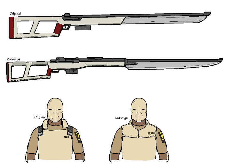
On another note, I here's a couple of redesigns:
-I decided to make the rifle-blade-thing a bit more realistic looking. The original looked a bit too blocky for my taste.
-I also redesigned the whole uppertorso/neck part of the cop's armor. It always looked weird to me, and drawing the neck thing with the straps on the sides was awkward from time to time. This new design imo looks cooler and is simpler to draw, so it's a win-win I guess. I may add more detail to the rest of the body armor, idk.
Tell me what you think.
Cheers!
Prov22
Damn I'm really glad to read and see these things you posted.
Btw for my taste old APD looks way better. His armor reminds of classic policeman bulletproof-vest much more than new one.
New one is like... postapocalyse knight I guess xD
Anyway goodluck with future content-making, I'm really hyped for more posting from you.
-Prov22 out
FEDEV
Thanks! Maybe I'll make a mix of both armor designs? I'll see what I do :P